- Customizable custom themes to keep your designs consistent
- Writing mode, distraction-free editing which hides the editor interface
- Auto-saves as you type
- Mobile-friendly so you can write and design emails on any device
- Support for images, buttons, social icons, dividers and columns
- The same interface for marketing and transactional emails
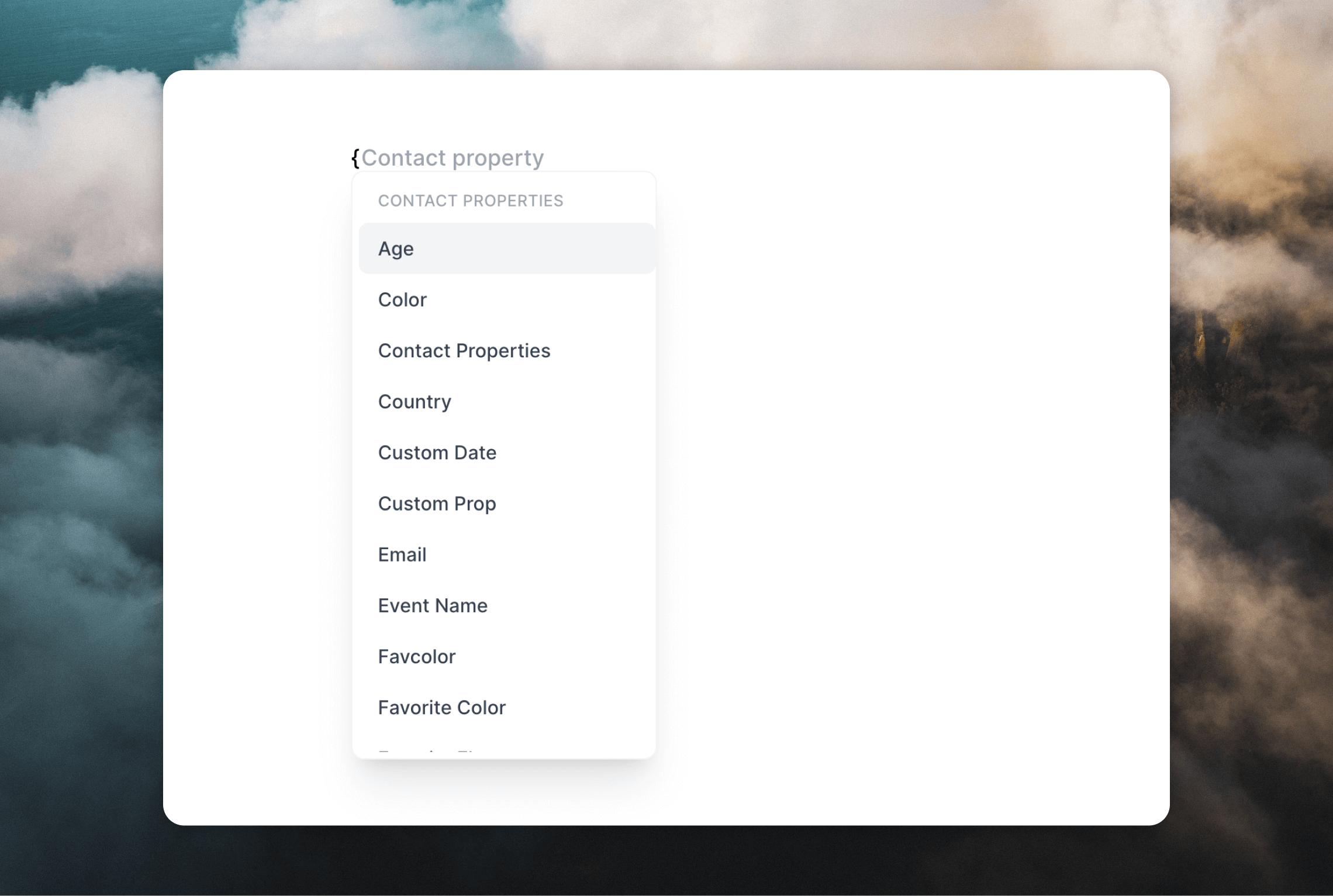
- Personalize emails with contact and event properties
- Helpful keyboard and Markdown shortcuts for adding content and formatting text
Formatting text
Once you have written content in your email, you will see formatting options appear in the right-hand panel. These options will change depending on the element you have selected in the email.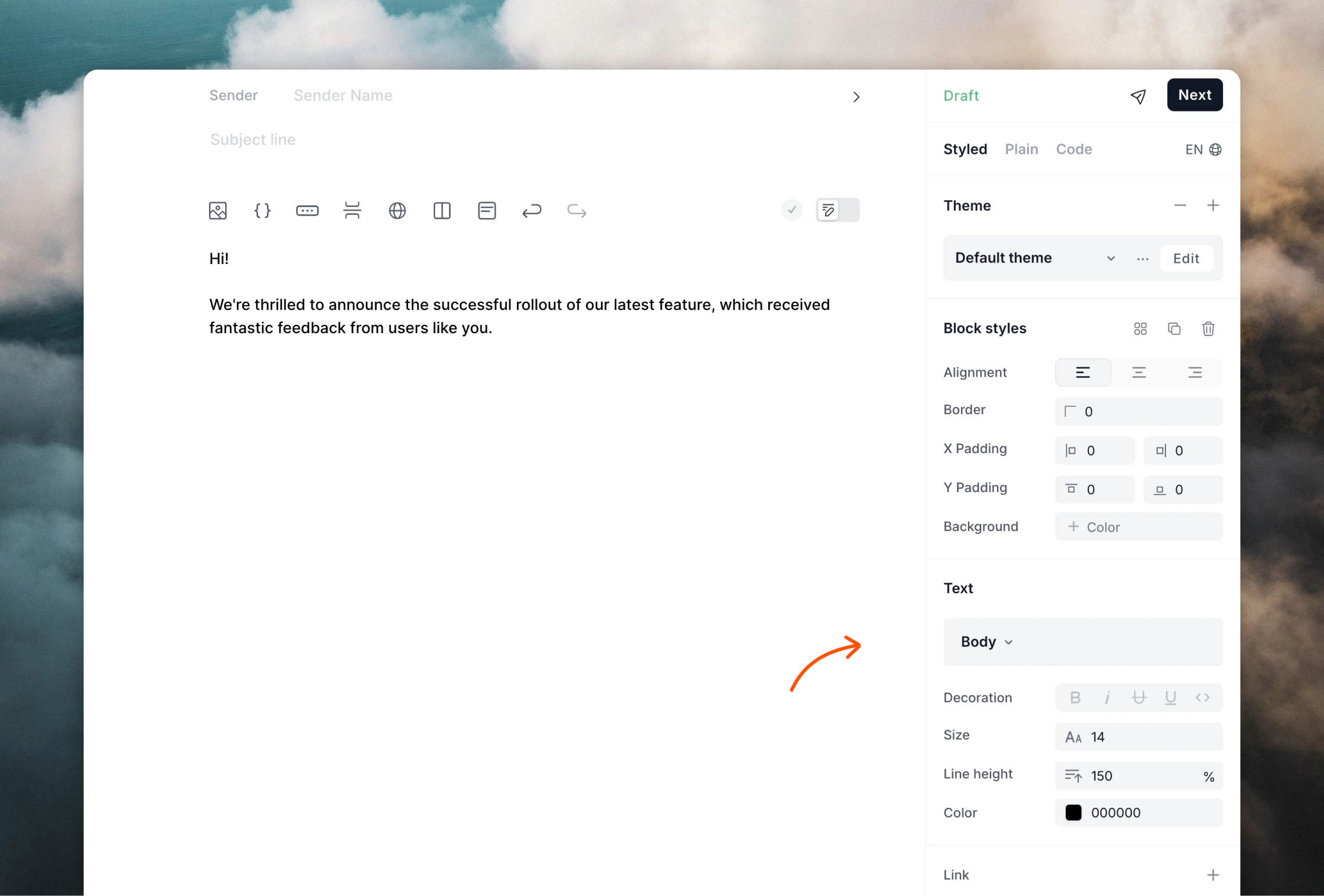
You can also use keyboard shortcuts and Markdown formatting to format your text.
Writing mode
To focus on writing your email, you can enter Writing mode. To toggle writing mode, use the switch just above the editor or use the⌘+/ (Mac) or Ctrl+/ (Windows) keyboard shortcut.
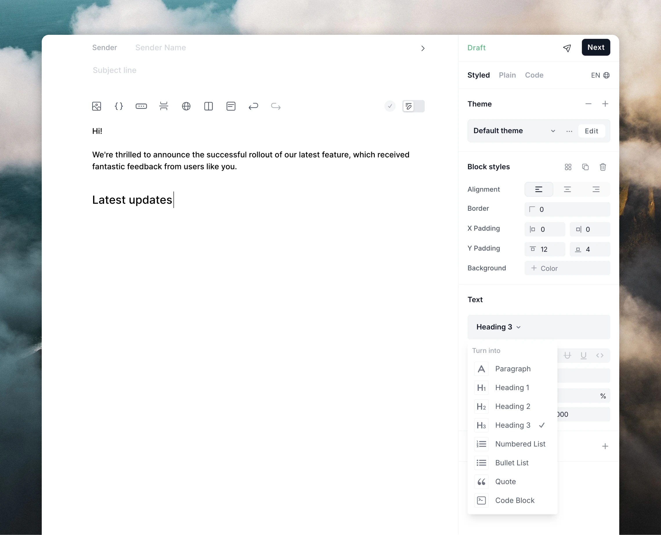
Adding elements
Emails can be more than just text. You can add the following elements to your emails:- images
- links
- buttons
- dividers
- social icons
- columns
- sections
- arrays
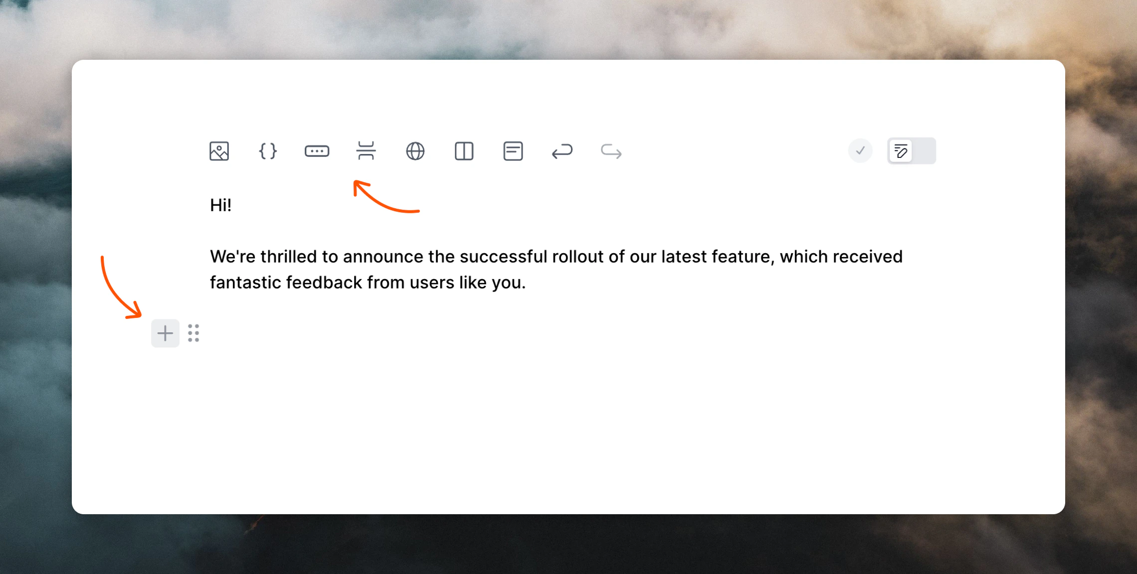
+ plus icon on the left.
/ in the editor:
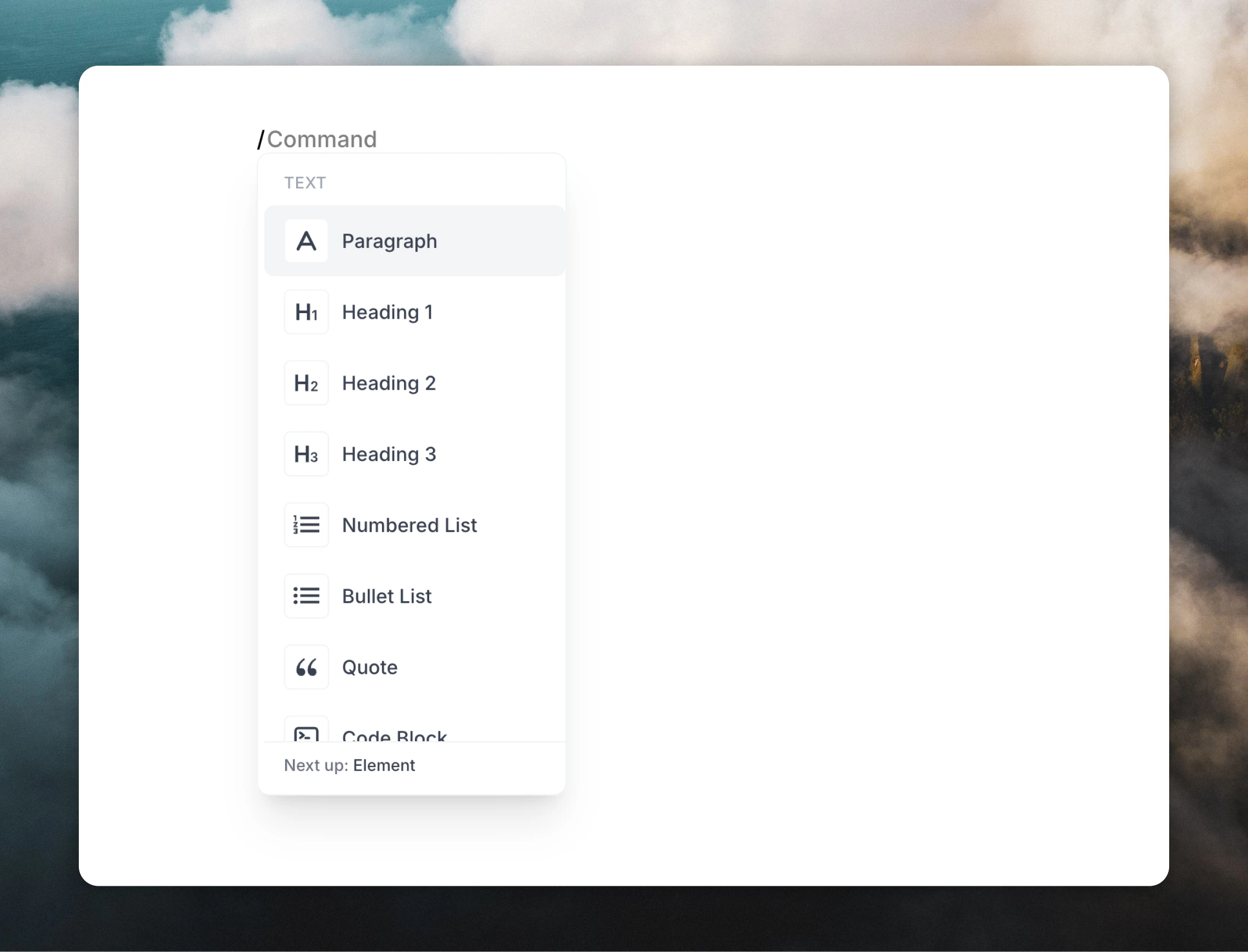
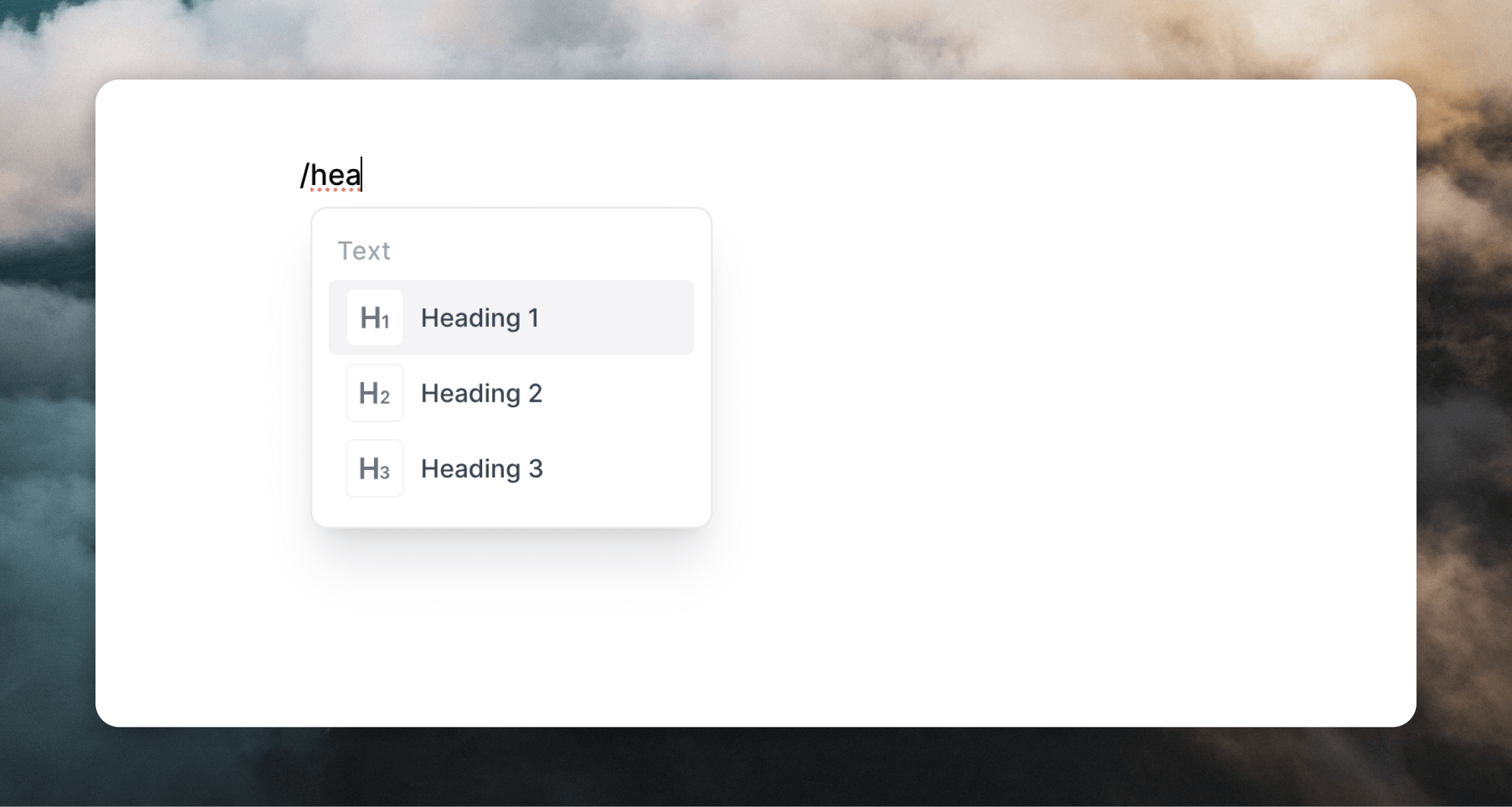
You can also use keyboard shortcuts and Markdown formatting to add certain elements to your email.
Images
Videos
Links
Buttons
Social icons
Dividers
Columns
Sections
Arrays
Markdown
Code blocks
Reordering content
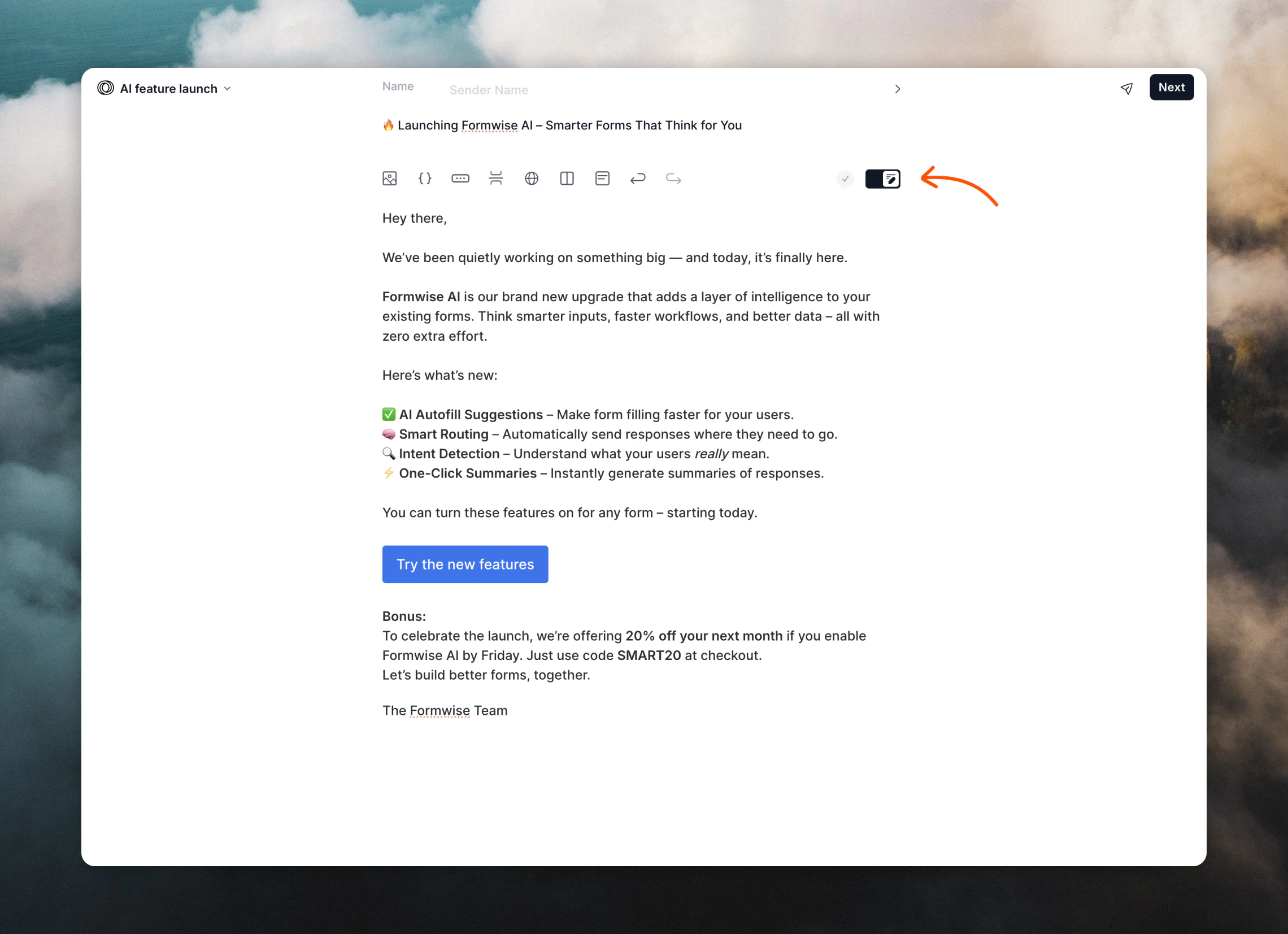
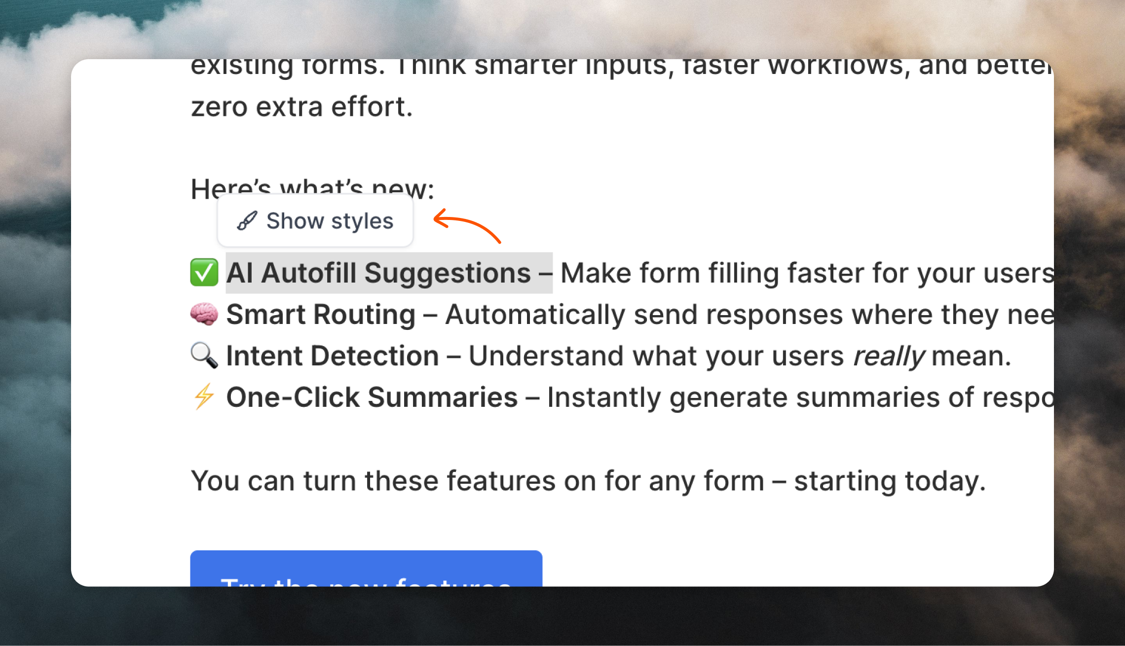
If you hover over a block in your email, you’ll see a drag-and-drop icon appear on the left. You can drag this icon to re-order elements in your email.
Footer content
We add an automatic footer into campaign and workflow emails, which includes your company name, address and an unsubscribe link.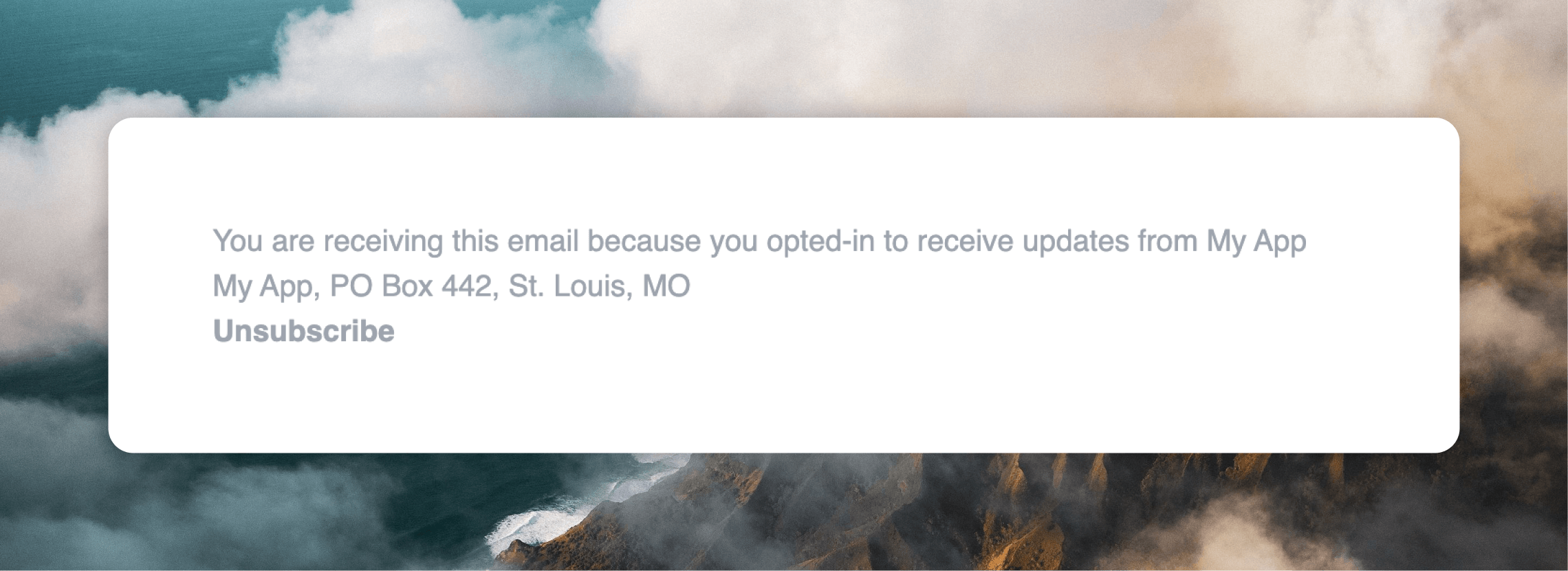
Keyboard shortcuts
The following keyboard shortcuts are available in the editor.The editor automatically saves your work as you type so there is no need to
save manually.
- Mac
- Windows
| Shortcut | Action |
|---|---|
⌘ / | Toggle writing mode |
/ | Insert a block (open slash menu) |
⌘ D | Duplicate a block |
⌘ K | Insert a link |
⌘ B | Bold text |
⌘ I | Italicize text |
⌘ U | Underline text |
Tab | Indent a list item |
Shift Tab | Unindent a list item |
| Shortcut | Action |
|---|---|
⌘ A | Select all |
⌘ C | Copy |
⌘ V | Paste |
⌘ X | Cut |
⌘ Z | Undo |
⌘ Shift Z | Redo |